HOME ARCHITECTS ® has been redesigning its website during the last 1-1/2 months. The firm has analyzed what users of the site enjoy, like & need and is providing those upgrades.
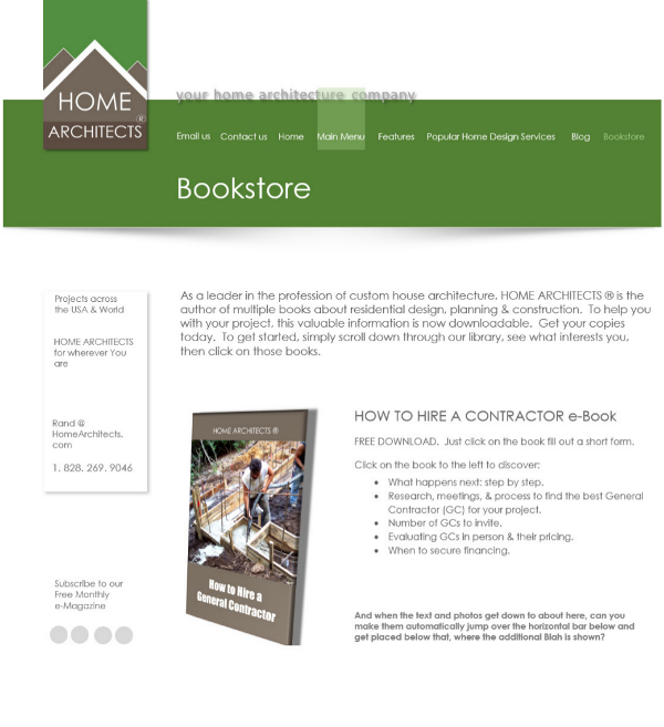
The firm has updated their graphics for the website, adding some minor flash content and some new pages, such as their BOOKSTORE, which will feature e-books written by the firm. The company is a leader in residential architecture and has created several books about subjects of interest to the firm’s clients. Most of these e-books are downloadable PDFs for Free. There are new buttons that call up subjects of interest on the homepage, secondary pages and blog posts, including links to previous posts and other pages that have interesting articles to help users and clients get the information they need to make good decisions about their projects.
There is more white space between text and graphics throughout the website, giving an enhanced UX (User eXperience). Readability and content prioritization has been improved, along with a higher graphic artistic quality. Also, the logo of the company has been slightly tweaked, to give it more figure-ground above the “mountains/roof”. The hope of all of this effort is that the website becomes more interesting, more informative, easier to use and above all more fun.
When: the IT people are very busy with assignments from their other clients, so the company is hoping to see the new format sometime in January. Exactly when is not known.
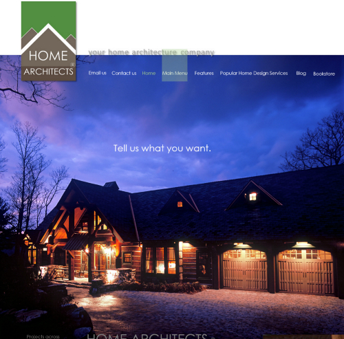
The HOMEPAGE: this has seen a huge renovation. There are a couple of different images that will be appearing, and the “Big Picture” has been increased in size, perhaps by about 30%. The first image will be full-screen (huge) a dawn photo of the company’s iconic Falcon Cliff Lodge, with purple clouds and all the lights on in the house. The horizontal menu is now white letters and is laid over the Big Picture.
There is a new “flash” message that will be appearing:
Tell us what you want.
Tell us what you need.
Contact Us.
Which underscores the firm’s focus on giving its clients what the clients want and need.
Much of the clutter has been removed. The idea with this unique approach is the constant battle between informative content versus the “portfolio” approach which by nature, is minimalistic. One gives more information, the other looks great. So what did the firm do? “Above the fold” the company went with the Portfolio, full width images. “below the fold” the firm went with upgraded graphics but still maintained good text information content. Having your cake and eating it too, was the approach.
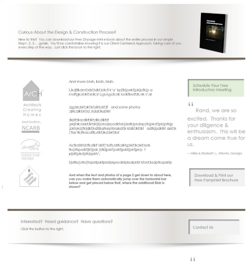
On the Homepage and on the other pages (called “Page 2s”) below the fold has seen a massive adjustment:
The previous 3 column format is still there, but has been sliced, diced and “white-spaced” by new “3D” horizontal page dividers (that appear to be coming right off the page) with simple and bold information content that refer to adjacent buttons to push or books to download to receive valuable information about the Design Process, Construction subjects, Free meetings and more. The entire layout is much more like an interactive, architecturally designed Control Panel with large buttons that make things happen and channel information to you about specific things that interest you. The suave new look provides much-needed white space and allows you to focus on each area of text better than before and calls your attention to slick, new graphic items, like the gorgeous new books ( and book covers) authored by the firm.
The BookStore is a long-planned resource improvement, featuring books authored by the firm. Original e-books with slick world-class cover art. Some only 21 pages long, others much longer and most are free downloads, with titles like:
How to Hire a General Contractor
How to Hire an Architect
Home Project Planning Guide
HomeOwner’s Guide to Managing the Design & Construction of your New Home
Client Centered Architectural Design Process
There is a brand new feature called ” WALK YOUR SITE WITH THE ARCHITECT” which has a button to push called “Start the Adventure”, which opens up a page that gathers information from you to begin the Site Analysis process on your own property.
It is also easier than ever to Contact Us, in several locations on each webpage, and the left column information resources are still there, but more spread out for easier searching for the subjects that interest you. This new website is as much a vast information library as it is a marketing tool.
The Share Your Dreams page is being revitalized, with great new graphics to make filling out the point and click options even simpler. Huge, bold new images of the firm’s projects highlight the new forms. Similar treatment is being focused on the Contact Us and other forms.
Even the main menu, itself has been renovated with a fresh, easy to read font and a floating “green window” that slides back and forth as you hover over your choices, to let you know where you are. In a nutshell, just about everything on this website has been scrutinized and redesigned to create a more enjoyable, more interactive, clearer and more informative User Experience for visitors. Stay tuned for upcoming news about the launch date expected for it to be online. We can’t wait!
tags: cashiers, custom, hendersonville, atlanta, orlando, aspen, telluride, virginia, lake wales, post and beam, timber frame


