Interior Renovations to Older House Look New: is about how this architectural firm programmed, planned, designed, documented and managed improvements to an aging house to make it vital, interesting and functional to its new owners.
Click image above to see the interior 3D video of this project.
The images you see on the online article give an idea about the renovations and additions that are presently designed and that will soon begin construction, on this Glenville, NC house. This house was originally built in 1981 (not designed by this Architect) and it has always been rather plain in appearance. This Architect points out that they enjoy making “plain” houses into something more than that. They said that they find it is easy for them to add features to a plain house to make it more appealing. Like the large new stair and elevator tower on the rear of this house, facing a large portion of the 50+ acre grounds of this estate.
In the interior, there are numerous updates involved, most of them functional, as well as aesthetic. For instance, the existing main level “fireplace” at present isn’t a real fireplace at all, but rather, a metal stove jammed into a brick wall. This is being replaced with a widened opening and a 2-way see through fireplace.
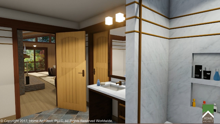
And the existing 1st Floor storage room is being converted into a new guest bathroom (which there never has been any to this date). This new sink and many of them in the house are being installed as accessible. New vanity tops and shower walls are to be Carrerra marble (white with gray streaks). However, marble is too slippery for floors, so shower floors will be flat cut river rock pebbles and the main bathroom floors will be gray slate with accent tiles of flamed granite (the torching renders the granite more resistance to slipping, which is always a safety concern in bathrooms).
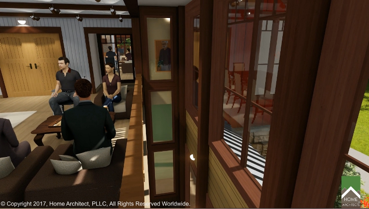
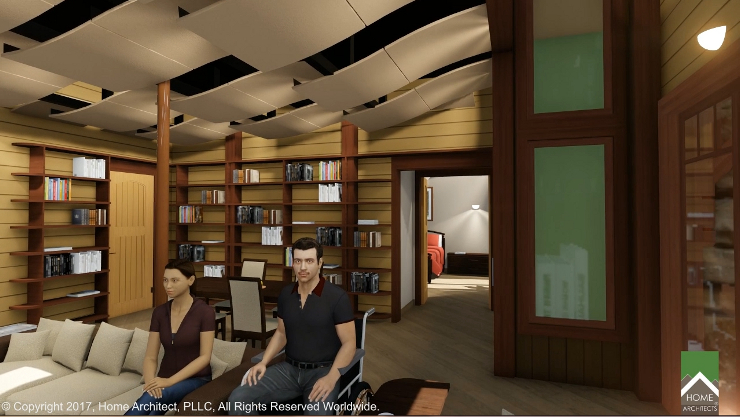
The new Elevator will facilitate movement up and down inside the house for one of the new occupants, who is in a wheelchair. The elevator can be seen below: it’s the beige colored object with a person inside it where you can see 3 vertical glass windows into the elevator shaft.
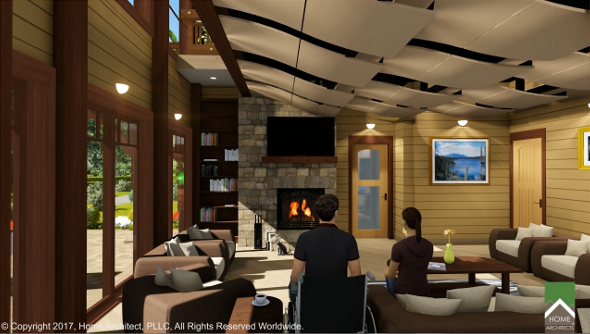
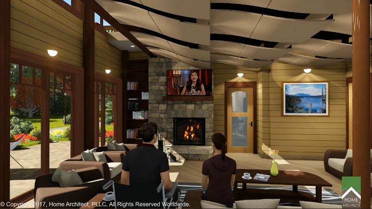
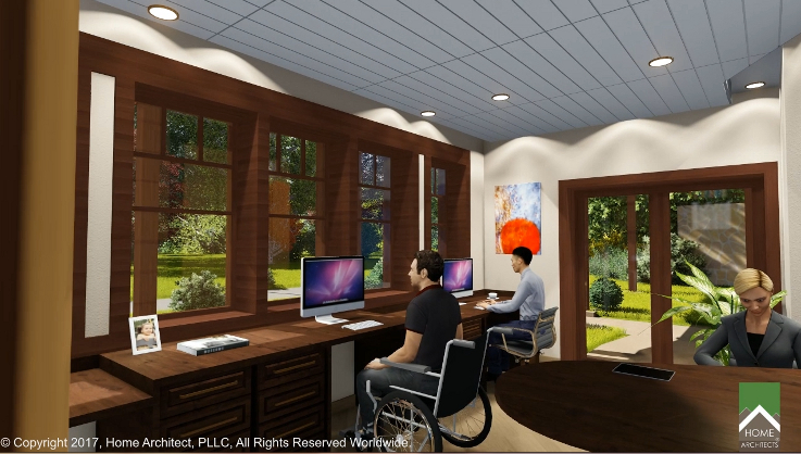
The Architect has space planned the furniture arrangements so that there is typically a “missing” chair.
This fills the function of having a space available for the person in the wheelchair being able to roll into and join in the group activities. Something not seen before, but a good idea. For instance, look at the image above. See the young man in the dark shirt with the dark hair facing the camera? Looks like he’s part of the furniture conversation grouping doesn’t he? He is. Because he’s in a wheelchair (there’s no conventional chair in his position there), and he can be part of that conversation grouping because there is no fixed chair there. Simple. Smart.
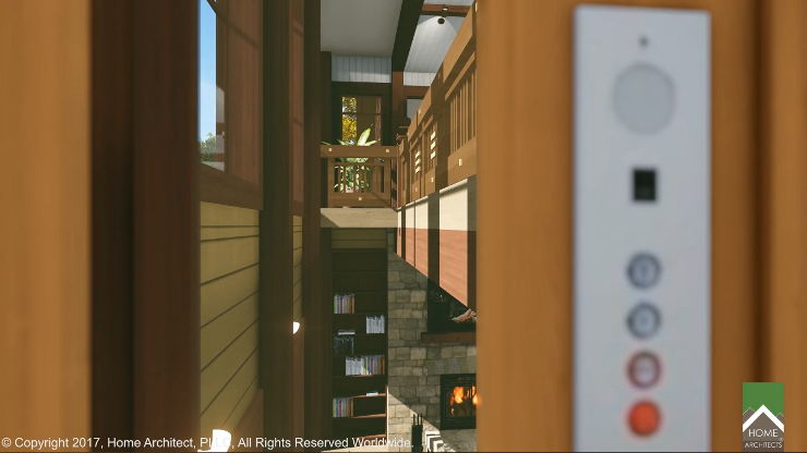
Above is a view from inside the elevator looking out a window in the elevator through the vertical panes of glass in the elevator shaft, at the vertical space connecting the Terrace Level (Basement) and 1st Floor. This was done to help remove the feeling of “basement” from the lower floor level. How basements have you ever seen that have a large space connecting up for about 30′ in height? None, right? Until now. And how many home elevators have windows? Not too many. Perhaps there should be more.
Above is another view of the Terrace Level Living Room, illustrating just how creative a ceiling can be by HOME ARCHITECTS ®. The Project Architect wanted to literally fragment the ceiling in the lower level, so that there was no hard flat surface, as there is at most basement ceilings. He researched, specified and combined some commercial ceiling panels in an unusual and artistic manner, then spaced them apart to give a lighter, more open feeling. He designed lighting between the panels to illuminate them indirectly, resulting in a feeling like clouds in a sky. They even appear to be moving, although they are fixed into place. Also, note the door between the home office and the living room: it uses seeded glass, to give more light into both spaces, while still obscuring direct viewing. And the tall (8′ high) SGD (Sliding Glass Doors) that have been introduced into the lower level provide natural light and commanding views over the 50 acres of woods, ponds and pastures, along with the even higher windows above, that also serve the 1st floor Dining area. No dark basement feeling here!
Here (above), a home Library was planned and detailed, as part of the Terrace Level Living- Dining open space planned area. The elevator is to the right.
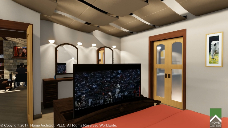
The basement master bedroom has a pop-up flat screen TV that comes up out of a foot locker at the base of the king-sized bed. Doors to the large adjacent bathroom have wood frames with seeded glass to admit light, but not direct views into the bathroom.
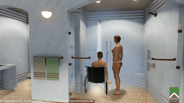
The palatial terrace level bathroom (above). No doors are necessary, due to the distances involved and the Architect designed clear tempered glass partial partitions with marble bases to keep the water and warm air inside the shower area. Note the artistic coordination of bronze tile accents in the marble tile work and the bronze towel racks, even the towels themselves. This Architect also plans recessed niches into the wall tile work for shower accessories like shampoo, body wash, and other personal items. Note the accessible marble sink to the left, and flat cut river rock pebble stones on the shower floor.
And here is the Home Office (above), also on the Terrace Level. New windows were cut into the basement wall to provide direct views to the outside and natural light from the inside.
tags: interior renovations, cashiers nc, lake toxaway, highlands, sevierville, tn, mountain, custom, timber fram, post and beam, hendersonville, aspen, telluride, lake tahoe

