Our Logo and what it stands for.
For a long time, the company logo was a red square with white letters. Simple and very sympathetic to Frank Lloyd Wright’s logo. Rand Soellner used to design projects for one of Mr. Wright’s main apprentices. However, Rand’s practice has focused for over a decade on luxury residential architecture in scenic locations like the mountains. The company designs wonderful houses. So they felt that an updating of their image was in order, hence their new logo, which they updated in spring 2012, then tweaked in early 2014.
 The new HOME ARCHITECTS ® logo is often paired with their website address:
www.HomeArchitects.com . Their website address underscores what the house design company stands for as well.
logo imagery.
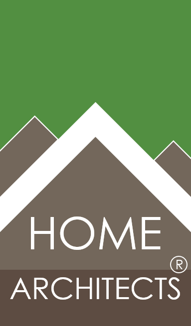
What does the imagery mean? First of all, the proportion of the logo: it is a golden rectangle, which is a very stable shape, and harkens back to classic geometry dating back centuries, to the very roots of architecture. So even the shape has some history of great thinkers & architects behind it.
 THE SHAPES: big and bold, front and center is a pyramidal shape that could be either a front elevation of a building or a section of a classic house shape, or a mountain. Both of these images are what the logo is all about: Houses and Mountains and other scenic locations. If viewed as a house, the slope of the roof is exactly 12/12, which is the traditional classic roof pitch of a house roof in locations that receive lots of precipitation in the form of water or snow. The company designs houses in places like this all the time, so that seemed to be a sensible and artistic image to use. There are 2 additional elements to the left and right of this main “roof” or “mountain” that one could view as intersecting gable roofs or mountain ranges beyond. Either interpretation works for the company.
THE COLORS: the “mountains” or “homes” or “roofs” are a warm grey. Lots of native rocks are this color, so this seemed logical as well as artistically compatible. There is a horizontal swipe of dark brownish-grey at the bottom of the logo, representing the bedrock of the firm’s practice in places like the mountains and this bedrock firmly secures the word ARCHITECT in white, solidly rooted in the bedrock and foundations of what the company does. The white color of the words HOME ARCHITECTS is meant to represent space, as that is what architects really design: the space in which you live. The Green sky above the house gables (or mountains, if you wish) represents trees and in general our Green Initiative that permeates all of our designs with Healthy Design concepts and sustainable architecture. Our initial graphic artist preferred a maroon background color, which looked quite nice and could have been interpreted as the setting sun, but we know that red sunsets are enhanced by greenhouse gases, and we wanted to make a “Green” statement, so we went with the grass green you see now.

THE FONT: the previous font was discovered to not be internet safe, which means that it could possibly be distorted on some people’s computers or not display at all. So the company ended up adopting a very architectural and simpler font. As it turns out, it is not internet safe either! This was a huge disappointment, so ultimately we decided to go with the new font as an image, rather than real letters, so now distortion should never occur anywhere.
Overall logo design.
Rand Soellner designed this logo, then had a graphic artist execute it in PhotoShop, then had another computer programmer/artist make additional adjustments in PhotoShop, then Rand made final tweaks in MS Word (mainly the much thicker and bolder white chevron/”roof”), to result in the final logo you see here and throughout our website. The initial graphic artist liked the simplicity and the firm worked with her to maintain the level of simplicity that also evokes the desired imagery. Having the artistic interpretations occur inside people’s minds is what the company was after here. The company thinks Raymond Loewy would be proud (the father of industrial design, who designed the Exxon logo, space stations, Greyhound buses, US Mail logo, multiple items for Coca-Cola).
Logo Designs for your business, created by architects:
YOUR LOGO DESIGN: This company designs logos for other companies, with the same kind of philosophical focus that you see that was devoted to their own.
Rand Soellner and the other consulting artists and computer technicians believe in a managed approach, in which Rand Soellner himself discusses with you what you stand for, then creates rough hand sketches of the possible logo imagery, then works with consulting computer programmer graphic artists to create the final image options for your selection and implementation with your stationary suite and website.
Contact for logo design: www.HomeArchitects.com
Links & resources:
home architects
timber frame architects
post and beam architects
log home architects
cottage architect
