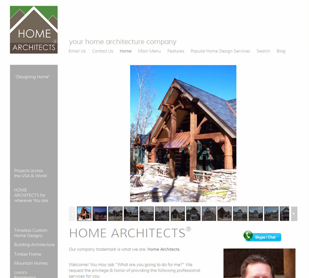
We’ve been working on this for almost a year: our new format for our website. We have listened to your comments and recommendations of website consultants & designers.
Cleaner, Bolder, Simpler Format
The new format is cleaner and bolder. It has a lot more images of our projects. There will be a initial video of Who We Are and What We Do, near the top of the HomePage and the Blog. This is will allow people to watch our video of less than 5 minutes duration and have an understanding of our background, our process and what we do for you. We’re starting this out with a green screen background, and we will be updating this within a month with a background images of several of our projects.
New Skype Video Conferencing / IM Features
We have upgraded our Chat feature to now be Skype-driven. This allows you to IM (Instant Message) us and, if you have a webcam, to have a video conference call with us. We have our webcam set to a default off, to avoid teenagers from Mumbai (or Tucson, for that matter) from mooning us! We establish an understanding of who you are, where you are from, what you want, and that you are a responsible adult sincerely interested in having us design your project, then we go live, if you would like that feature. You can download Skype for free. They also have paid features, but you don’t need them to have a video conference all with anyone on the planet! How cool is that? That’s the next best thing to “being there.” And we are one of the few residential architects on the planet offering such a communication personalized feature. Watch for this soon, on our newly renovated website. Look for the “Skype / Chat” blue button on the right side of our new format, just under the HomePage’s “Big Picture” scrolling thumbnails, and on our Blog near the top on the right side.
Simpler Menu
Our new menu is near the top of the page (and also at the bottom). It is horizontal, and is easy to read and understand. Each choice has a drop-down choice list.
Easier to Read
We have increased our font sizes for nearly everything. We have also increased the spacing between text lines and doubled the spacing between paragraphs. We have provided much more white space, everywhere. Instead of a “Times Square” website design approach, we created a “suburban walk” approach. In other words, there is not a whole lot going on at any one location on the page. As you scroll down, “walking” through our new format, you will begin to find information here and there about subjects on which you may choose to click. Or there may be an informational pamphlet that might want to click and download, or not. It is your choice. And there are several large quotes from us and our previous clients and other information that you may find useful.
Upcoming Videos
We are developing our video-making capabilities and will be adding more videos in the future, as we go along. We are starting with a simple one-on-one interview with Rand Soellner, AIA, our senior staff architect explaining the architectural project process, his background, education, and how we help our clients reach their residential design goals.
Be on the lookout for the new format, we expect it to be online within a week or so.
tags: architectural websites, atlanta, chicago, aspen, telluride, hendersonville, newnan, cashiers, highlands, glenville, murphy, post and beam, timber frame

